
|
|
 01-13-2009, 10:26 PM
|
|
|
Bring me Geno.
Join Date: Sep 2006
Casino cash: $10004900
|
Your thoughts on my NEW uniform design.
This is going to get lost in Pioli (invisible deity bless him) madness, but here it goes.
I think it was about a year ago when I last attempted this. As a former graphic design student (now English major) I still dabble in the art, and the most difficult project I've ever attempted is the Kansas City Chiefs. I WILL BE THE FIRST TO SAY: I DON'T THINK CHANGE IS NECESSARY, but it couldn't hurt, especially if done subtly and with NO BLACK. I want to keep the blindingly awesome red as the center of the design, but integrate just enough yellow to make it consistent (the yellow, that is). I know most Chiefs fans don't want black, but I argue constantly with very talented sports design enthusiasts who insist me to add black just as the 49ers did, as an accent color. Unnecessary, in my opinion, and I'm sticking to my guns here. We bleed red and gold. You don't add a rival team's color, even if it is just black. I've seen it done (with Chiefs uniform concepts), it's not horrible, but it isn't needed either. I of course left the Lamar Hunt patch. **** it. You probably aren't going to read all that anyway. Here you go: 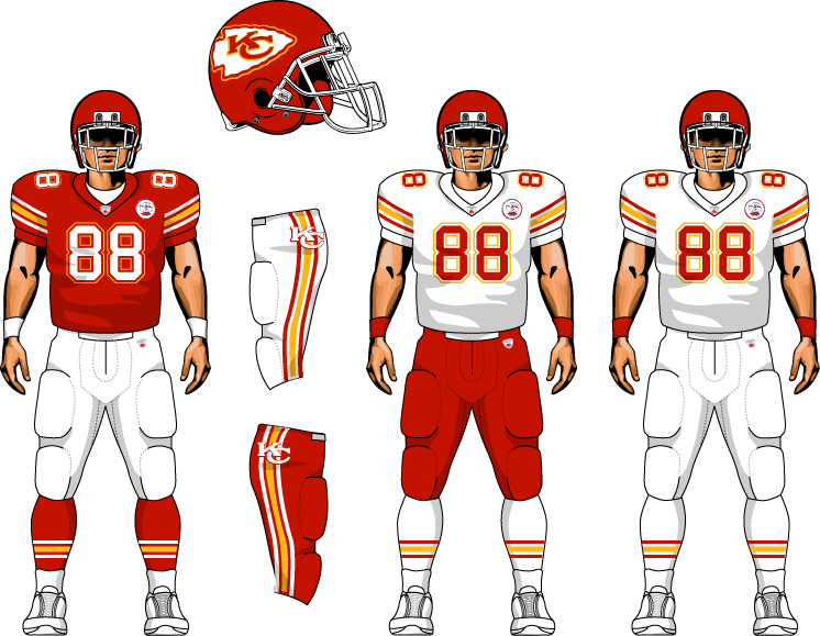 |
|
Posts: 1,938
  |

|
|
02-05-2009, 10:41 PM
|
#121 | |
|
BAMF!
Join Date: Nov 2007
Casino cash: $9549897
|
Quote:
__________________
Main Entry: bowe·ner Pronunciation: \ˈbō-nər\ Function: noun Date: circa 2007 |
|
|
Posts: 8,358
 |
|


|
|
|


 Your thoughts on my NEW uniform design.


 Linear Mode

